
Watching the March 2015 Ted Talk on flag design and how a cool city flag might inspire people was like taking a “red pill.”
In the 1999 film “The Matrix,” you take a red pill if you want to discover an uncomfortable, life-changing truth. You take a blue pill if you want to remain content but ignorant of what’s really happening in the world.
I watched that Ted Talk last month and I now face an uncomfortable truth: Springfield’s current city flag is lamer than a Dad asking you to tug on his finger.
In that talk, I learned that our current flag — which has been around since 1938 — violates major tenets of not only flag design but overall design.
Now, I care about our city flag, but only because I know how bad it is. It’s like not really noticing my nose until someone points out a zit on it.
When I look at our city flag now, I roll my eyes just like my son does when I ask him to tug on my finger.
A new flag was first proposed in Springfield in 2017 by a group of residents called the Springfield Identity Project.
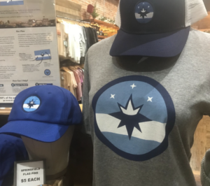
Since then, the proposed flag and other merchandise with the flag logo have been sold, primarily at 5 Pound Apparel.
John McQueary, co-owner of the Vandivort Hotel, is in the Springfield Identify Project group. He tells me this local flag movement started as a result of the 2015 Ted Talk.
City Council is expected to vote Jan. 10 on whether to accept the proposed new flag. The council is welcoming comments and other design proposals here until 5 p.m. on Jan. 7. You can also call 417-864-1888.
This is the proposed new flag.
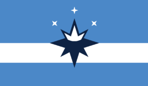
It has a white stripe meant to symbolize the Ozark plateau and Route 66. In the center, a “compass rose” combines two Springfield identities: the compass, symbolizing the city’s role as a national crossroads and a crown, a reference to the city’s nickname “Queen City.”
The three stars represent innovative spirit, connection with nature and Ozarks culture.
I wish the symbolism was less vague. The three white stars, for example, could represent anything you say they represent.
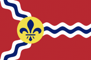
As I wrote in a Jan. 2020 column in the News-Leader, my favorite flag is the current city flag of St. Louis, adopted in 1964.
The three wavy blue lines represent the Missouri, Mississippi and Meramec rivers joining near St. Louis.
The fleur-de-lis represents the French heritage of the city. It’s on a gold disc that represents the $3 million in gold that was the down payment of the United States’ Louisiana purchase in 1803, total price $15 million.
The symbols in the St. Louis flag have a greater connection to the city of St. Louis than the symbols on the proposed new Springfield flag have to the city of Springfield.
The Frisco Railroad, for example, had a tremendous impact on the history and growth of Springfield. Could that not have been symbolized on the new flag?
I can’t help but think that there is a better way to symbolize historic Route 66 than a straight, white horizontal bar.
“Save Our Flag” shirts
Ten people spoke about the flag at a Dec. 13 City Council meeting. Most were in favor of the new flag.
Some of the current flag proponents wore shirts to the meeting that read: “Save Our Flag.”
In this age of deep division, some apparently view the proposed change as downright un-American.
This comment was posted on a Facebook page that supports the new flag.
“NO NO NO NO NO NO NO !!! THIS IS ABOUT AMERICA, NOT A FEW RADICAL GROUPS,” wrote Larry Doke. “LEAVE OUR FLAG ALONE OR LET THE PEOPLE, NOT COUNCIL, VOTE ON IT. I WILL VOTE AGAINST ANYONE WHO VOTES FOR THIS. WHAT HAS HAPPENED TO THIS COUNTRY ? I AM ASHAMED TO HAVE BEEN IN THIS COUNTRY’S ARMY TO BE DISRESPECTED BY THIS OFFENSIVE DISPLAY OF SO CALLED EQUALITY. NO TO THIS FLAG WITH MY WHOLE HEART !!!”
Despite the commentator’s capitalization, I support the new flag.
So you know, I responded to Doke’s post. I wanted to ask him why he thought the proposed new flag was offensive to him as a veteran. I wondered if he perhaps thought the discussion was about altering the U.S. flag. I did not hear back from him.
But my comment did lead me down a rabbit hole in which one commenter said he thought the new flag was “commie looking” and told me the impetus for the new flag was based on “liberal bs.”
“This state is way better off deep red,” he wrote to me. “New flag blows.”
On the one hand, he’s right in that the proposed flag has no red in it.
On the other hand, aren’t Communists known as “Reds”?
So what’s wrong with the current flag?
In my humble opinion, when many of those who oppose the new flag ask, “What’s wrong with our current flag?” — they really don’t want to know what’s wrong with our current flag. But I’m going to tell you anyway.
According to the Ted Talk, there are five basic principles in flag design.
One is that a flag should not have letters on it.
It’s a symbol. The U.S. flag, for example, does not have the words “United States Flag” on it.
“If you need to write the name of what you are representing on your flag, your symbolism has failed,” says Roman Mars, the man who led the Ted Talk.
That is true of all symbolism, I think, whether it’s in works of fiction or cinema. For example, in the movie “Cool Hand Luke,” Luke (played by Paul Newman) eats 50 hard-boiled eggs to win a bet and lays on a table with his arms stretched out and his ankles crossed.
Dragline (played by George Kennedy) does not look straight into the camera and say, “Will ya look at the Christ imagery in this shot!”
Another reason not to put words on flags is that most flags are on a pole and are viewed from a distance of 100 feet, meaning that only eagles could read the words if eagles could read.
One rule of flag design — or any good design — is to be distinctive.
Our current flag is about as distinctive as a happy-face emoji. It’s a rip-off of what, in 1938, was the City of St. Louis flag.
Here’s the current city flag.

Here’s what the city of St. Louis flag was in 1938.

Neither of the above flags is much different from the Missouri state flag, adopted in 1913.
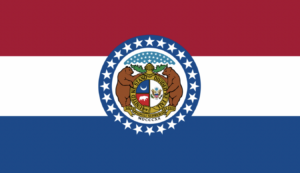
Yes, we have two grizzly bears on our state flag. They symbolize the state’s strength and its citizens’ bravery. But they might as well be whales, mastodons or unicorns because grizzly bears never inhabited Missouri.
I’d rather have two strong and brave Hellbender salamanders. At least they live here.
The Ted Talk of 2015 includes comments from Ted Kaye, author of a 16-page pamphlet titled “Good Flag, Bad Flag: How to Design a Great Flag.”
Kaye says: “A well-designed flag could be seen as an indicator of how a city considers all of its design systems: its public transit, its parks, its signage. It might seem frivolous, but it’s not.
“Often when city leaders say, ‘We have more important things to worry about than a city flag,’ my response is — if you had a great city flag you would have a banner for people to rally under to face those more important things.”
Maybe that’s true, but I doubt that it is.
I don’t see Springfield residents gathering under a flag, new or old, to charge into the issue of homelessness.
But a new and better flag would at least put an end to people staring up at our current flag and asking:
“What’s that say?”